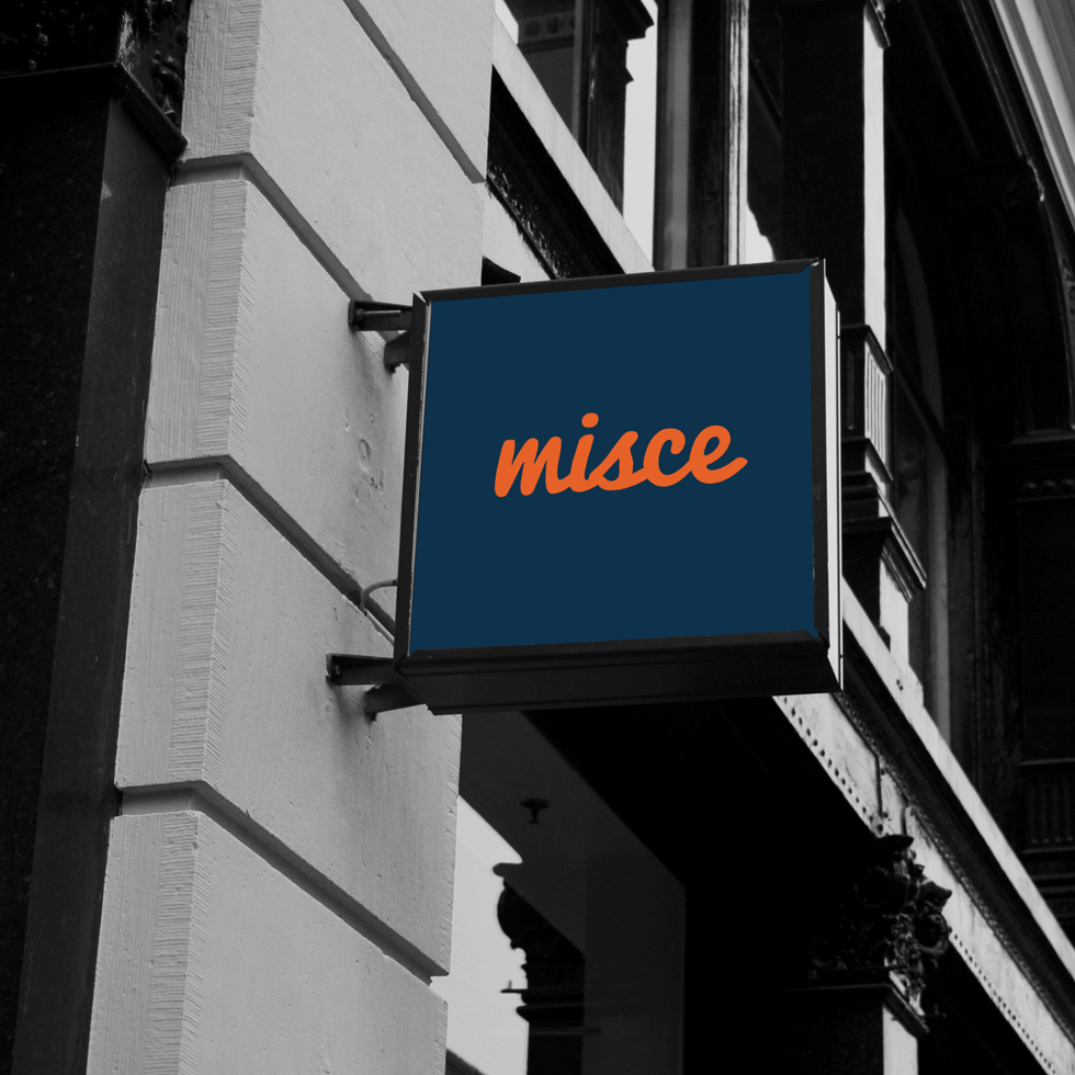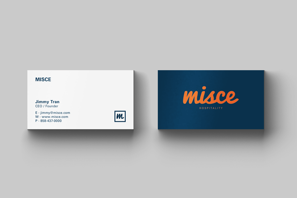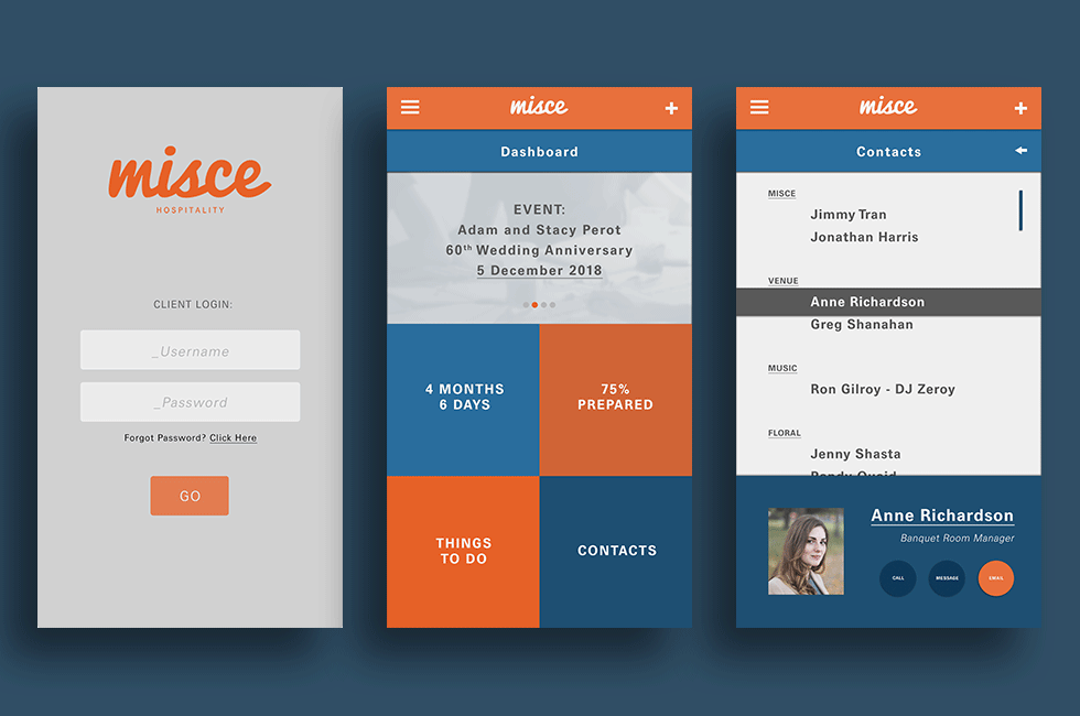
Design - Logo spec design for an events management and hospitality company. The definition of misce is to mix. As a hospitality company, Misce is involved with connecting and bringing together the right mix of vendors, venues, and personnel to execute the perfect event.
Intentional choice of cursive style typeface with slight manipulation to connect letters closer together for a modern and clean look. Lowercase to feel less corporate and more welcoming. The color orange is used to convey safety, energy, and creativity and blue to represent dependability.